Blazorise 0.9.4 is out and ready for big leagues
No matter how fast I think each Blazorise version will be done, it always takes at least a quarter of the year. This time it’s no different and based on past experience, I guess we’ll have to follow the same release cycle in the future. Only time will tell.
In any case, the new major Blazorise v0.9.4 is finally here!
Don’t let yourself be fooled into thinking v0.9.4 is just a small update from v0.9.3. The road to v1.0 is long and steady, and the main reason for such small numbers on our major releases is due to some poor planning at the very beginning and letting myself get lost with handling version numbers. But hey, it can happen to just about anyone else! 🤷♂️
A lot of good things have happened after the latest major release.
The biggest change is that Blazorise has gone commercial and we are now offering Blazorise support and licensing for commercial organizations. I would say the start was good, and while there was some negative feedback, the change was mainly positive and we believe it will allow us to focus even more on making and improving the quality of this great product, while still maintaining that “open source” spirit and making sure Blazorise is easily accessible to most developers who don’t categorize as a commercial organization.
One of the good things is that we were able to hire @David-Moreira to become the first official Blazorise team member. David was already quite an active contributor to the Blazorise codebase and it was only natural to offer him a new role. And as a result, he has done some very good things with the new DataGrid features 💪.
Breaking changes
Unfortunately, with every new major release, we introduce some breaking changes. And we do make a point to raise these changes on GitHub for discussing not only by the Blazorise team but also the community, where the community can always be heard, providing insight and feedback.
So we make sure we bring them for good reasons and this time is no exception so we’ll try to at least offer some background and explain our thought process behind the changes:
- Textual utilities went through the changes, so instead of having
ColororAlignmentparameter we now haveTextColorandTextAlignment. While it is still not a breaking change the original parameters will be removed in thev0.9.5. The good news is that now text utilities can be used on every component and not just on typography components like it was until now. - We made some small optimizations to the Modal dialog and as a result,
Dialogparameter is now removed fromModalContent. It was used only by the Bulma provider and so we made it so, that it is now used implicitly by the framework if the appropriate conditions are met. - We changed the
SearchValueon the DataGrid filter fromstringtoobject. This was needed so that you could implement better filtering without DataGrid formatting your numeric or date values into unsupported format values. Progresscomponent went through some optimizations and as a result, we removed theBackgroundparameter and replaced it with theColorparameter.- Dropping eFrolic support and since its author has stopped maintaining eFrolic, we have decided to stop supporting this provider and move focus elsewhere. This will allow us to focus work on new providers that are actually actively maintained.
Migration
- In
RichTextEditOptions, renameDynamicLoadReferencestoDynamicallyLoadReferences - Typography utilities are renamed and now they have a
Text*prefix. Affected components areDisplayHeading,Heading,Paragraph,Text,CardSubtitle,CardTitle, andCardText. The changed parameters are:ColortoTextColorAlignmenttoTextAlignmentTransformtoTextTransformWeighttoTextWeight
Progresscomponent:- Use only
Progresscomponent becauseProgressBaris now only needed for multiple stacked bars, eg.<Progress Value="50" /> - Replace
Backgroundparameter with theColorparameter
- Use only
- Remove usage of
Dialogparameter forModalContent. - Change
TooltipPlacementparameter toTooltipPlacement, eg.Placement="Placement.Left"toPlacement="TooltipPlacement.Left" - For DataGrid
ReadDataevent callback, renameDirectionattribute toSortDirection - Datagrid: Due to a refactoring of the resizable feature to the Table component, you should note the following:
- The DataGrid resource CSS we had previously introduced, does not need to be added to your application in this version. However with the newly added Virtualize feature, we had to keep the blazorise.datagrid.js, and it will be a continuously essential resource of the DataGrid.
- If you had the resource below, you can now safely remove it:
<link href="_content/Blazorise.DataGrid/blazorise.datagrid.css" rel="stylesheet" />
- If you had the resource below, you can now safely remove it:
- The
DataGridResizeModeenum no longer exists, and you will need to useTableResizeModeenum instead. - DataGrid
FilteredDataChangednow accepts theDataGridFilteredDataEventArgs<TItem>as the argument instead ofIEnumerable<TItem> - On
DataGridColumn, renameDirectionparameter toSortDirection - Whenever you use filter
SearchValuechange its type fromstringtoobjecttype
- The DataGrid resource CSS we had previously introduced, does not need to be added to your application in this version. However with the newly added Virtualize feature, we had to keep the blazorise.datagrid.js, and it will be a continuously essential resource of the DataGrid.
- Charts
- Move
BarThicknessandMaxBarThicknessfromBarChartOptionsto theAxisoption.
- Move
Highlights 🚀
The list of changes is really long so I will try to make it as short as possible by just mentioning the biggest. You can discover the rest on your own 😜, or you can follow us on Twitter where we will regularly post about new Blazorise features and improvements.
Async Validation
There are situations when you need to do validation by connecting to an external method, backend or a service. Since calling these can take some time it is not advised to do it in a synchronous manner as that can lead to a pretty horrible UI experience. So to handle these scenarios we have added support for asynchronous validation. We introduced new asynchronous validation handlers which you can use in a similar way as a regular validator handler. Instead of using Validator you may use the new AsyncValidator parameter.
For more information and an example just take a look at the Async Validation page section.
Services
For the longest time, this was one of the most requested features and we were finally able to introduce it!
-
IMessageServiceis used to show simple messages and confirmation dialogs to which the user can respond. It contains some standard methods likeInfo,Success,Warning, or even theConfirmmethod for use cases when you need to prompt the user for an action. -
INotificationServiceis used to show simple alerts and notifications with a small timeout after which it will auto-close. -
IPageProgressServiceis used to show a simple progress bar at the top of the page.
To learn more about these components please visit Message Service, Notification Service and PageProgress Service pages.
Rating component
A lot of times you need the ability to allow your users to rate your product or a service. With our new Rating component you will be able to do so. The usage is very simple and can be done with just one line of code, eg.
<Rating Color="Color.Primary" @bind-SelectedValue="@SelectedValue" MaxValue="10" />

To learn more about this component please visit Rating page.
Markdown component
The New Markdown component is also part of the release. It is based on the excellent and well-maintained Easy Markdown Editor JavaScript library. It has all the basic editing features like bold, italic, code snippets, headings, etc. With time we hope to introduce and support even more of the Easy Markdown Editor features.
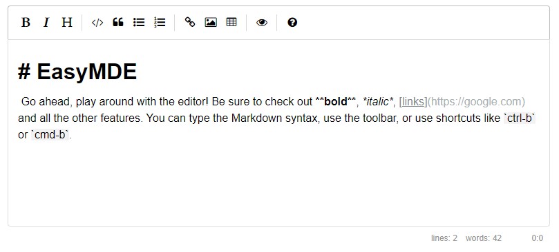
To learn more about this component please visit Markdown page.
Carousel animations
A lot of refactoring went into the Carousel component and we now fully support Slide and Crossfade animations.

Utility first
One of the main focus of this release is the utility first approach. We put a lot of effort to create a lot of new utilities for easier components manipulation. The list of new utilities includes Flex, Sizing, VerticalAlignment, NoGutters, Shadow, Border, and many more.
Flex utility is our most advanced fluent builder so far and if you’re familiar with Bootstrap Flex utilities you will find our new feature to be quite similar to it. We support all Bootstrap Flex utilities, including media breakpoints. The same feature is also provided for every other provider, Bulma, AntDesign, Material.
One example of how the new Flex fluent builder utility works:
<Div Flex="Flex.JustifyContent.Start">
    ...
</Div>

<Div Flex="Flex.InlineFlex.AlignItems.Center">
    ...
</Div>

<Div Flex="Flex.JustifyContent.Start.OnTablet.JustifyContent.End.OnDesktop">
    ...
</Div>
Next on the list are the Border and Shadow utilities.
<Span Border="Border.Is1">All</Span>
<Span Border="Border.OnTop">Top</Span>
<Span Border="Border.OnRight">Right</Span>
<Div Shadow="Shadow.Remove" Background="Background.Light" Padding="Padding.Is3" Margin="Margin.Is5.FromBottom" Border="Border.Rounded">No shadow</Div>
<Div Shadow="Shadow.Small" Background="Background.White" Padding="Padding.Is3" Margin="Margin.Is5.FromBottom" Border="Border.Rounded">Small shadow</Div>
<Div Shadow="Shadow.Default" Background="Background.White" Padding="Padding.Is3" Margin="Margin.Is5.FromBottom" Border="Border.Rounded">Regular shadow</Div>
<Div Shadow="Shadow.Large" Background="Background.White" Padding="Padding.Is3" Margin="Margin.Is5.FromBottom" Border="Border.Rounded">Larger shadow</Div>
We also moved all typography utilities to the BaseComponent class so they can be used with any Blazorise component. This should allow for more flexibility when building and designing the UI. While it is still not a breaking change it is advised to add Text* prefix to the current typography parameter as they will be removed in the future. The affected components are DisplayHeading, Heading, Paragraph, Text, CardSubtitle, CardTitle, and CardText.
Simplified Progress component
We have worked hard to make the Progress bar simpler to use, so we can keep your fingers rested. Hey, every letter counts! :)
Previously the progress component was used like:
<Progress>
  <ProgressBar Value="50" />
</Progress>
and now you only need to write the following(for single value progress).
<Progress Value="50">
The old way of using the Progress is still supported but is now better suited for stacked bars when you need to show multiple values.
Background color
Having the ability to set the background color to any component is a must-have feature. That’s why from now on, the Background parameter is available to all components making it much easier to customize the look of your application.
Global Theme Size
Now it is possible to globally change input and button sizes. This will greatly improve the ability to customize the application’s look and feel.
Autocomplete improvements
FreeTypingbinding support andFreeTypingvalidation support- You are now able to use
Autocompleteas a suggestions source to the user. Meaning you can enable this feature, andAutocompletewill accept any value introduced by the user and bind it on theSelectedTextparameter. - By enabling this feature, you will still be able to use the Blazorise validation, but now validating the
SelectedTextparameter.
- You are now able to use
NotFoundEventCallback andNotFoundContent- You will now be able to handle cases where the value introduced by the user is not found on the data source that has been provided to
Autocomplete. Either by providing some feedback to the user, by using theNotFoundContentor just by handling it as you wish by listening to theNotFoundEventCallback.
- You will now be able to handle cases where the value introduced by the user is not found on the data source that has been provided to
- Show all items
- This can be done by just setting the
Autocomplete’s MinLength to 0. We’ve made sure to provide initial styling to accommodate all items with a scrollbar.
- This can be done by just setting the
- Added support for a custom filter
Autocompletealready provides filtering capabilities out of the box. However, you may now provide a custom filter that’s based on the current text being searched and the data-source items.
- Improved the selection box to have the same width as text field by default and able to limit suggestions shown at a time with a scroll bar
- These two improvements will provide a better user experience by having the selection box be compliant to the text field’s width, as well as handling multiple items, by providing a scroll bar, which would otherwise go out of the screen.
DataGrid public API
A lot of internal and protected DataGrid methods are made public and can now be used. You can now use all the basic commands like New, Edit, Save, Cancel, Sort, and others.
The list doesn’t stop there. We also added two new APIs, UpdateCellEditValue and ReadCellEditValue to be used in edit mode. This will allow you to cascade and update any cell dynamically and not just the one you’re currently editing.
DataGrid data-annotation validation
This feature was requested for far too many times and we can finally say it is ready. Data-annotations can now be used for validating the DataGrid editing fields. This feature is now the default option once UseValidation on DataGrid is enabled. If you want to have any other validation method, like Validator for example, you just need to define it on DataGridColumn of your choice and it will override the default data annotation validation. We hope this new feature will help you even more in building your applications.
Datagrid Virtualization Support
With .NET5.0 Blazor brought us built-in virtualization support with the Virtualize component. Now Datagrid brings that same Virtualization support to you!
By setting Virtualize, you will enable virtualize capabilities on the DataGrid, meaning that instead of using the DataGrid’s pagination, you’ll now be able to scroll across the data with perceived improved performance.
Virtualization is a technique for limiting UI rendering to just the parts that are currently visible. For example, virtualization is helpful when the app must render a long list of items and only a subset of items is required to be visible at any given time.
You will still have access to every available DataGrid feature.
VirtualizeOptions allows you to further customize the Virtualize feature.
Table FixedHeader ScrollTo support
You are now able to use the table’s internal API to either scroll to a row or pixel offset from the start of tbody.
Here’s an example, of how to scroll to the first row on the table.
private Task ScrollToRow()
    => tableRef.ScrollToRow( 1 ).AsTask();
And an example, of how to scroll to the position of 250px.
private Task ScrollToPixels()
    => tableRef.ScrollToPixels( 250 ).AsTask();
Date and Time pickers
With this version, we introduce two new input components, DatePicker and TimePicker values that are based on the excellent JS library flatpickr. We tried to cover as many of the flatpickr features as we could while still making it easy to use. You can have its native calendar picker, date and time formatting, manual input mode, etc.
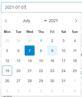
The existing component DateEdit and TimeEdit are still available and they will continue to be used in places where you don’t need too advanced features and when you want to use native browser controls.
To learn more and to see more examples please look at DatePicker and TimePicker pages.
SpinKit
We also added a new extension for spin animations, based on the nice SpinKit library. It supports all of its animation types, and it also supports custom colors through the Color parameter.

For more info just look at the SpinKit page.
Honorable mentions
We got over 50 PRs coming from our new and old contributors in this version. The biggest contributor by far was David-Moreira but since he’s now part of the team I’m not counting him as an contributor anymore, only the team member. Sorry David 😛.
Next on the list, by the number of PRs, is SimonCropp. Simon helped us to clean the code, optimize async state-machine, remove unused code, fix comments and many many more.
Just before the release StefH found the way to have JavaScript callbacks for our ChartJS extension. While it is just a small change currently, we will build upon it and add more callbacks in the next version. And we already have some ideas on how to make it even better.
Jimmys20 helped us to improve the ListGroup component and added support for the Color parameters, and easier handling of selected list-group items.
Sorry to not be able to mention all you guys but the post is already too large. We thank you all for your time and help with contributing to Blazorise. As I’m always saying, everything is possible only because you continue to use and work with Blazorise. So once again, thank you! 💪
The future
Starting from now our main focus will be Blazorise v0.9.5 which is going to be the final beta before the final v1.0. The main two points of v0.9.5 will be support for Bootstrap 5 and final optimizations of the current Blazorise API. After which we will likely not going to introduce any major change to the API.
We also have plans to create a new blazorise.com website completely in Blazorise along with the new documentation pages that will have code examples and snippets, code copy/paste and more.
Support
Blazorise company is still very young, and if you wish to support continuous work on Blazorise and to help us grow the team please consider buying the commercial license. You can also consider becoming a special sponsor and you will be listed on our project page.
Closing notes
We can finally conclude both Blazorise 0.9.4 and this already too long post. For all of you who got this far, thank you. If you enjoyed reading it, share it with your friends and colleagues!
Also, don’t forget to star us on GitHib and follow us on Twitter or Reddit.
Thanks for everyone who has contributed to making Blazorise another great release.
Thanks for being a Blazorise developer.